
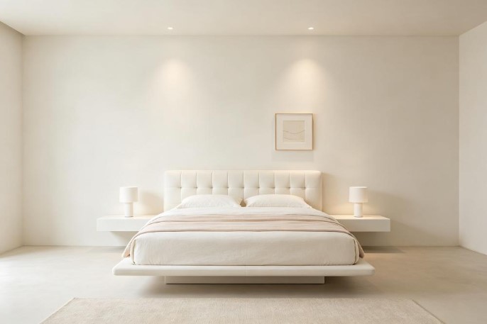
Pearly White SW-7009 sits just one number away from Alabaster in the Sherwin-Williams lineup, and most people assume they’re interchangeable. They’re not. The undertone tells a completely different story. I’ve used Pearly White on walls and trim in my guest bedroom and kitchen, and the pink surprised me more than I expected. Here’s the real picture.
What Is Pearly White SW-7009?
Pearly White is a warm white from Sherwin-Williams with an LRV around 83. That’s high enough to read as a true white in most rooms bright, open, and airy. It’s in the same light range as Alabaster and Pure White, but the warmth it carries has a different character than either of those.
On the chip it looks like a soft, neutral warm white. Nothing dramatic. On the wall, though, the specific undertone starts to separate it from the pack. It’s not a yellow warm white or a creamy warm white — it goes in a different direction. That difference is subtle in some rooms and obvious in others, and it all comes down to what’s underneath.
Does Pearly White SW-7009 Look Pink?
It can, and that’s the main thing to know. Pearly White’s primary undertone is a soft pink — sometimes reading more peach depending on your light and surroundings. It’s not loud. You won’t walk in and think “pink walls.” But compare it to a yellow-based white like Alabaster and the pink warmth becomes clear.
The pink shows up most in north-facing rooms, next to cool gray floors, or under cooler artificial light. In those settings, Pearly White can take on a blush-warm cast that you might not have anticipated from a color with “white” in the name. In warm, sunny rooms, the pink recedes and the color reads more like a gentle warm white. If pink undertones bother you at all, test this one carefully before committing to a whole room.
Pearly White vs. Alabaster — What’s the Difference?
Alabaster SW 7008 is the comparison you have to make since they’re right next to each other in the lineup. Both have an LRV around 82-83. Both function as warm whites. But the undertone split is real.
Alabaster leans yellow. Its warmth reads as creamy think butter, linen, warm milk. Pearly White leans pink. Its warmth reads softer and slightly rosy more like a pearl than a cream, which is exactly what the name suggests. I put them side by side on Paintuma on a real wall photo, and the difference popped immediately. Alabaster looked warm and golden. Pearly White looked warm and blushed. If yellow warmth feels right to you, Alabaster. If pink warmth feels right, Pearly White. They’re solving the same problem with different undertones.
How Does It Look in Different Lighting?
South-facing rooms are the kindest to Pearly White. Warm sunlight keeps the color feeling balanced and soft the pink settles down and you get a gentle warm white that doesn’t lean too hard in any direction. This is where it looks most neutral.
North-facing rooms pull the pink forward. Without direct sun, the cool light amplifies that rosy undertone, and Pearly White can start looking distinctly warm-pink rather than just warm. East-facing rooms shift through the day — pinker in the cool morning, warmer and more balanced by afternoon. West-facing rooms glow golden in the evening, which pushes the color more toward peach.
Bulb temperature has a big impact here. Warm white LEDs at 2700K can push the pink toward peach. Cool daylight bulbs at 4000K or above make the pink more obvious. I found 3000K to be the best balance.
Does Pearly White Work on Exteriors?
It does, and the high LRV actually works in its favor outside. In direct sunlight, Pearly White reads as a clean warm white. The pink undertone fades under strong sun and you get a soft, inviting exterior that doesn’t look stark or cold.
In shade and under overhangs, the pink comes forward more you’ll notice a warmer, rosier quality on those surfaces compared to the sun-exposed walls. The variation is usually subtle enough that it works. For a traditional or cottage-style home, Pearly White on the exterior with dark shutters or a bold front door looks polished. If you want an exterior white with absolutely no pink risk, Pure White SW 7005 or Alabaster SW 7008 are safer bets. But if a slightly rosy warmth appeals to you, Pearly White holds up well outside.
What Trim Color Pairs Best With Pearly White?
If Pearly White is your wall color, Extra White SW 7006 gives you a crisp contrast. It’s a cool true white that makes the walls read clearly as a warm color. The line between wall and trim feels clean and sharp.
For a softer look, using Pearly White on both walls and trim in different sheens works well — flat on walls, semi-gloss on trim. The sheen difference creates enough separation. I slid Pearly White SW-7009 next to a few trim options on Coloraw to compare the contrast levels, and Extra White gave the most definition while the tone-on-tone approach felt the coziest. Alabaster on the trim also works — the yellow-pink difference between Alabaster trim and Pearly White walls is visible but gentle.
What Are the Closest Matches From Other Brands?
Benjamin Moore White Dove OC-17 is the most commonly cited cross-brand match. Both are warm whites in a similar LRV range. White Dove carries a touch of gray complexity that Pearly White doesn’t have, and it leans slightly less pink. White Dove is the more neutral of the two, though they’ll read similarly in many rooms.
Benjamin Moore Simply White OC-117 also enters the conversation, but it’s brighter and more neutral — less warmth overall. It doesn’t carry the pink. For an exact cross-brand match, Pearly White’s specific pink-warm profile is hard to nail because most other brands’ warm whites lean yellow rather than pink. Bring a large painted swatch if you’re trying to match at a different store.
Should You Sample Pearly White SW-7009 Before Buying?
Definitely. The pink undertone is the whole story with this color, and a small chip doesn’t show you how it’ll behave in your specific room. What reads as a neutral warm white in one setting can read visibly pink in another.
Paint a large swatch on two walls — at least a foot square each. Watch it in morning light, afternoon light, and under your evening lamps. Pay special attention to any north-facing wall where the pink will show the most. Give it two full days before deciding.
For a quick preview, paintcolorvisualizer.com lets you upload a photo of your own room and test the color for free. It works for interior and exterior. It won’t replace paint on the actual wall, but it gives you a fast read on whether the warmth level sits right in your space.
Bottom line: Pearly White SW-7009 is a warm white with a pink lean that sets it apart from the yellow-based crowd. Test it in your light, own the blush warmth or move on to Alabaster, and you’ll land in the right place.